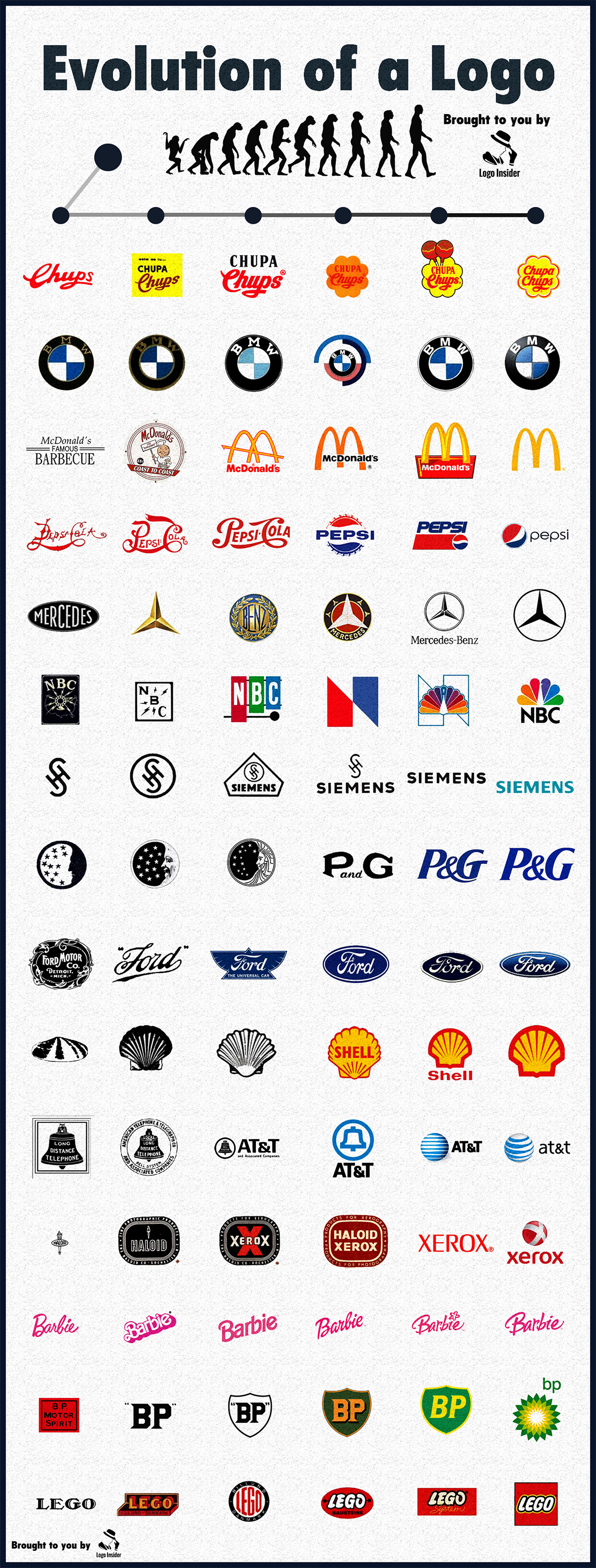
Logos are, at their core, visual shorthand Logos are not just beautiful symbols, but the nitty-gritty of identification, emotion history and marketing wrapped in a single image. However, as times progress, so did the messages brands want to convey. The infographic above shows how the logos of some of the most iconic companies have changed through the years.
The changes are not just aesthetic but also give an insight into other things that have changed. Lets examine this change in detail not only about what changed but why it changed
🌀 From Ornate to Minimal: The Overarching Trend
All the logos shown above suggest one thing: simple is best!
Logos have transitioned from busy, heavily illustrated logos in the past to simple, flat, monochromatic designs in today’s world. It isn’t just a fashion issue, it’s something that stemmed from needs and mindset of consumers.
Back in the 1900s, fancy logos were a fancy-pants act. The design language of official-looking documents, letterheads, and stamps was copied. In a screen-centric world, legibility at small sizes becomes indispensable. Clean lines and bold shapes survive compression A logo that works on both a billboard and a smartwatch is a modern design imperative.
Take Ford, Shell, or Pepsi Their first logos were stuffed with words or decorative art. Today’s versions? Streamlined, instantly recognizable, and scalable
🚀 The Power of Color: Visual Memory in Branding
Another subtle shift is the use of color psychology Early designs mostly used black and white or muted tones as they were limited by early printing. In contrast, modern logos overflow with purposeful colors.
- Pepsi’s red, white, and blue colors reflects its American origin.
- BP switched to green and yellow to underline its environmental makeover.
- The yellow of Shell is quite prominent in the oil competition and offers recognizability at home.
It is interesting to see how solid these colors’ schemes stay once in. The color acts as a visual anchor even if the shape goes through evolution.
🔄 Typeface Tells a Story
Typography is more than just font choice, it’s voice.
- McDonald’s began with serif-heavy lettering, borrowed from its post-war American diner identity. It eventually focused on the golden arches alone, such a strong brand that it doesn’t even need to use its name.
- The Barbie logo used a script typeface that ‘updated’ as the years went on, retaining a fun, engaging personality.
- BMW and Mercedes-Benz kept their logo intact but updated the lettering for sophistication and modernity.
These days, sans serif fonts are in fashion. They inspire trust, clarity and appear high-tech. This shows how more and more people are now seeing logos printed on a laptop screen.
🧠 Semiotics: What Do These Logos Mean?
Your logo is not just a brand design it is a sign.
- Starbucks kept its mermaid but abstracted and cropped it, shifting focus from a niche maritime theme to a broader, more modern coffee culture.
- The peacock has become cleaner, yet still communicates a message of diversity and creativity.
- The flower shape of Chupa Chups retains its essence and ties back to Salvador Dalí’s original 1969 design.
Brands like Siemens, P&G, and AT&T have completely removed most of their symbols and shifted to wordmark. This suggests that corporations are becoming confident enough that they don’t need symbols, just the strength of their name.
⚙️ Function Follows Form: The Tech Constraint
As logos evolved, so did the mediums they appear on. Logos were made for store front, print ads, and products. Logos need to fit inside app icons, favicons, wearables, responsive websites, etc. That’s why we’re seeing flatter design styles, more circular or square shapes (e.g. BMW, Pepsi, Xerox), and fewer fine details.
Flat design isn’t a trend; it’s a survival adaptation.
📉 The Risk of Over-Simplification?
Overdoing refinement will lead to similar design styles.
Some critiques say that modern logos risk becoming so similar they’re overly sanitised and bland. If everything’s flat, minimal, and sans serif, it’s hard to tell apart. Present P&G, AT&T, and Xerox their current logos are interchangeable with a tech startup and hardly anyone would bat an eyelid.
Brand equity cannot merely be in the logo but the total experience. A simplified log often indicates confidence in the product/service itself.
🌱 A Logo is Never Finished
According to the infographic, the most intriguing takeaway is that no logo is ever really finished. Even classic logos like LEGO and BMW changes behind the scene. Because brands aren’t static Logos are never “done.” That’s the curious conclusion of the graphic. This just means that evolution is not for the strongest but the most adaptable.
🔍 Final Reflections
What we see here is not the basic graphics design history, but a society platform. Designs started changing as the values shifted towards speed, clarity and fluency. They are now made clear, fast, and easily recognizable. In a world full of data, a strong logo has to cut through the clutter- quickly.
So next time you glance at a logo, remember: that tiny symbol is the product of decades of evolution, user psychology, corporate strategy, and artistic expression. It’s not just a logo, it’s a story… distilled.