

Hey guys, come closer, because if there’s nothing I like more than a good piece of cultural commentary, it’s a colour-coded analysis of 90s sitcom characters. We’ve got a great infographic that maps the appearances of the recurring characters of Seinfeld. At a first glance it might look like a boxy rainbow, but there are so many delightful details packed in behind all those little squares.
Jerry Seinfeld: The Neurotic Everyman.
To start with we mean the mind behind the show! In the first chart (leftmost), he is practically a pink avalanche, appearing in (almost) every single episode.
What’s striking? We may kick things off with the namesake: Jerry Seinfeld himself. Look at the leftmost chart: He’s a pink avalanche, appearing in (almost) every single episode. It’s somewhat like spotting a Bigfoot appearance. You know it’s in there somewhere, but you’re not entirely sure where or why.
George Costanza: The Ultimate Doomsdayer
Next up, we have the anxious and perpetually worried George Costanza. His bar features orange squares which map out his many outbursts throughout the seasons.
Key takeaway: The data suggests George is not only Jerry’s co-conspirator but is also an ever-present fixture of the show. His appearance track is almost as jam-packed as Jerry’s. In case you think you could escape his whining and plotting, think again!
Cosmo Kramer: Unleashing Chaos.
We move on to the unstoppable force that is Cosmo Kramer. Blues and turquoises chart his unstoppable mania.
Fun fact: When you look at the distribution of Kramer’s episodes—nearly wall-to-wall—there are virtually no gaps. There’s this unstoppable friend at the door you just keep letting him in when ever it opens. The image shows how the show uses Kramer’s entrances, Fall downs, hair brained business ideas for most of the time.
Elaine Benes: the voice of (kind of) reason
Elaine’s character is highlighted in green in the infographic. If there was green, it could have been worse.
Why it matters: Elaine misses the pilot episode entirely, since she wasn’t part of the original concept, but from the second she’s introduced, she’s indispensable—almost as omnipresent as Jerry, George, and Kramer. The squares have the colors that show that Elaine might be the glue behind ot all.
Ruthie Cohen: The Underestimated Overachiever.
One of the biggest shocks of the whole infographic has to be the unassuming cashier, Ruthie Cohen. Those purple squares sure add up. She appears in an incredible number of episodes—most often silently in the background, just minding the cash register, but still there.
Take note: While she rarely steals the spotlight, Ruthie’s cameo count is far more than many of the more flamboyant, better-remembered characters. This shows you how impactful these understated characters can be in building the Seinfeld world.
Newman: Arch-Nemesis Extraordinaire.
Newman and Jerry sure had a lot of run-ins throughout the series, as evidenced by the pinkish squares dedicated to just him.
Data insight: Newman racks up appearances in a hefty chunk of episodes—usually at pivotal comedic moments. If you thought that Jerry’s door opens a little too frequently to that guy who looks like a deranged zoo animal, you’d be right! That guy is Newman.
Susan Ross: The Tragic Tale of Invitations
George’s bride becomes the unfortunate victim of cheap wedding invitations. Susan’s cameo blocks are a soft shade of purple. It’s a captivating visual as you can tell by the colors and seasons and the episodes around which her arc revolves—especially that disastrous exit in season 7. Tragedy Thy Name Is Invitations: You see a short but intense cluster of squares—then poof, she’s out.
Frank & Estelle Costanza: A Couple of Yellers
George’s parents come with their blocks connected: Frank in pink, Estelle in gold, showing how they brought full-blown yelling into the sitcom koning.
What stands out: While neither appears as continuously as the core four, they both pop up with surprising regularity. The infographic shows that they all come together and have a patchwork in one way or another in George’s life. Usually, this happens to scold him or each other.
Helen and Morty Seinfeld are flip-flopping retirees living in Florida.
Jerry’s parents, like George’s, appear in bursts. The mom (Helen) has scattered purple squares, while the dad (Morty) might have a shade of gray.
Reading between the lines: Their appearances spike especially when Jerry journeys to Florida or they come to Manhattan for more comedic friction. The distribution shows how Seinfeld would use visits from the parents to create chaos again for Jerry and co.
J. Peterman, Uncle Leo, and the Other Eccentrics.
- J. Peterman (the one in hot pink squares): Most of his episodes concern Elaine’s workplace but he can also be made to appear at random times when the show wants to mock inelegant writing or bizarre adventures.
- Uncle Leo (red squares): Sparse but always unforgettable. You can identify the precise storylines in which he gets involved, borrows without asking, or simply shows up to yell, “Jerry! Hello!”.
- Mr. Wilhelm, Mr. Steinbrenner, Mr. Pitt, Mr. Lippman: The stripes of data for these folks speak to Seinfeld’s comedic approach of using flamboyant bosses to mirror the corporate or social structure each main character is forced to deal with.
David Puddy: A True Face-Painting Hero
- Look at David Puddy’s performances, usually separated towards the latter seasons where Elaine is off-on dating him.
- Worth noting: Puddy’s squares are less frequent, but the comedic impact is outsized—like a meteor dropping in for a few episodes and leaving an impact crater.
Mickey Abbott and Jackie Chiles.
- Mickey (red or pink squares): Kramer’s pal, often roped into comedic subplots like seat-fillers, double-dates, or doing stand-in work. Though his bar is thinner than the heavy-hitters, it is wide enough to show how often the show turned to him for quick laughs.
- Jackie Chiles (purple squares): The flamboyant lawyer shows up mostly in the final seasons. The diagram shows how often they use him for a quick laugh-ending with the finale.
The Meta References: Larry David Cameos And Superman References.
You might find cameo references near the bottom (or end).
- Larry David (orange squares): He voiced George Steinbrenner, appeared briefly as the caped lawyer, and popped in as a few random side characters. The chart shows all those episodes you may not have known were him.
- Superman references (red squares, presumably): Jerry’s well-known affection for the Man of Steel often manifested in subtle ways. The data squares might show these as hidden surprises the series.
The Seinfeld Data Analysis about Nothing
These charts make a footprint of all the main characters where episodes were arranged based on the percentage of total laughs that occurred in the episodes and the rate at which those laughs happened. Each colored point is one episode for a character. Bigger circles mean that character has a bigger share of the screen in that episode. If you see a huge dot over at the top of the grid, you can safely infer that the character hogged all the laughs in that episode and was also on-screen a lot.
When we look towards the distribution, we might see “peak” performances where a character’s dots cluster towards the top-right. This shows episodes where they had a higher rate and share of laughs. The episode “The Stake Out” of Jerry bubbles to the top left quadrant whereas George blooms closer to the upper right with “The Note”, indicative of George being high up in the episode ranks where he seized the laughs with his frets and schemes. Showings that generate fewer laughs or have reduced screen time sink down toward the bottom left. This can be due to the fact that the episode didn’t focus much on them.
Finally, these visual groupings reveal interesting trends. Kramer, for one, has loads of teal dots on the middle-right, indicating he frequently causes quick-but-high-impact laughter, even if he’s not always top dog for an episode’s total laugh share. In the later season’s Elaine’s golden cluster gets skewed upwards and to the right which shows how she became one of the major laugh givers. If you look at the size and placement of the clusters, you can get a sense of how each Seinfeld character’s comedic influence grows (or shrinks) over the course of the series, with some episodes giving them a lot of real estate and some each getting a small patch of unremarkable territory.
1. Distinct Comedic “Footprints”.
Each character has a unique pattern of dots on the chart, indicating differences in dominance or sharing. You can see from Jerry’s large tendency to cluster in the upper-half (high laugh share), that George has a big scattering in the upper-right (many “quick-hit” comedic moments), Elaine’s points gradually move upward and rightward through time, and Kramer’s teal markings show that he’s a bursty character—he often gets a high laugh rate even if he’s not always the longest-running on-screen.
2. Episode “All-Stars”.
The episodes, The Stake Out (Jerry), The Note (George), The Cadillac (Part 2) (Elaine), and The Slicer (Kramer) get picked out for each character which means that character drew a large share to their laughter for that episode. Their dots are far from all the other dots, which suggests that these were true highlight performances, where the writing gave them the spotlight.
3. Shifting Dynamics Across Seasons.
With every new season, new characters will come in, some writers will get upgraded to main status. As the seasons go on, Elaine is seen in increasingly comedic well-done performances. George’s scatter also widens as he begins to have more of his own comedy. All in all, the chart suggest seinfeld turned into a much more even, ensemble comedy, with each individual getting a turn.
Character Laughing Statistics Visualized
This chart shows how much each of the four main Seinfeld characters contributed to the overall laughs on the show. Over on the left of the image is the total laugh counts (e.g., Jerry’s 8,467) and the percentages show what share of the show’s laughs each character is responsible for and also what share of their own screen-time produced laughs. For examples , in 27.8% of the times he’s on-screen , Jerry causes laughs while accounting for 28% of the total laughs. This shows he’s both quite visible and pretty reliably funny.
The colored bar segments in the graph display, character wise, how the share of laughs for each of them evolved across the seasons. George’s bars, for example, may start at a high level, take a dip from the mid-point of the series, and then climb back up when the storylines get better for him. Meanwhile, Elaine was providing a laugh or two when she was on even though she got less screen-time overall. These bars show how each character’s comedy went up and down, giving us a peek into how funny they were across the series.
To the right, we see line or bar graphs displaying those laughs throughout every episode. So, you can easily spot the peaks (where a character dominates an episode) and valleys (where they take a step back to let someone else shine). Kramer’s graph might be more spiky because when he’s on, he’s really on – those short but high bursts of laughter cushion his lower screen time. Those graphs let you compare how each character’s comic influence scales not just overall but episode by episode.
Top Insights
- Jerry’s All-Around Dominance: He leads in total laughs and manages to sustain a high “laughs per screen-time” rate.
- George’s “Second Banana” Strength: Although second in total laughs, George’s neurotic intensity consistently boosts his laughs-per-minute.
- Elaine’s Underrated Punch: She may have fewer total laughs, but her best seasons show solid comedic spikes, especially as her character grows more prominent.
- Kramer’s Spike Factor: His comedic style produces big laughter blasts in shorter intervals, evident in the high-laugh-rate portions of his chart.
- Seasonal Shifts: Each character’s bar chart highlights notable peaks in specific seasons, illustrating how the writers rotated comedic emphasis among the core four over time.
The Soup Nazi Data Chart
This chart’s upper part shows the different characters who pop up at each moment in “The Soup Nazi” (S07E06) and how often they make you laugh. The different color horizontal bars show when Jerry, George, Elaine, Kramer, or others appear and make the audience laugh. If you look closely, you’ll see that the earlier moments are dominated by Jerry and George (blue and orange), followed a little later by Elaine (yellow) and then Kramer (teal), becoming prominent in the mid-to-later segments, especially after the soup stand is introduced.
You can point out clearly where things are happening through time in the episode. Further, this is shown minute-wise. These black bars tell us when we switch locations from Jerry’s apartment (or “Jerry’s home”) to the diner, workplace or outside. Take a notice of the fourth minute and you see an internal or external cut where everyone will shove off to the Soup Nazi. This geolocation information reveals just how much time is spent away from the usual places which is an interesting consideration given the episode is centered on one new place.
The table on the right shows overall rankings and the percentages related to each character and joke. Jerry appears in 61% of all episodes throughout the series, George in 47%, etc. the numbers that lend perspective to their presence in “The Soup Nazi.” In the same way, the percentages of laughter reveal how often each character “owned” a scene with the Soup Nazi himself (under “Other persons”) producing quite a big hit despite low total screen-time. Overall, this gives us a picture of who’s on screen when, and how well they share that screen time.
Top Insights.
- Character vs. Time: Jerry and George dominate the first half of the episode, while Elaine and Kramer ramp up their presence in the second half.
- Location Shifts: Much of the comedic action takes place outside regular spots (e.g., Jerry’s apartment) and centers around the soup stand, illustrating how a single location can drive most of an episode’s conflict.
- Impact of Secondary Characters: Despite fewer scenes, the Soup Nazi (grouped under “Other persons”) commands a high laugh density, showing how a well-written guest role can steal the show.
- Broader Context: The percentages on the right situate this specific episode’s balance of screen-time and laughs within the overall series, underscoring just how central each main cast member usually is—and how an iconic guest star can upend that dynamic.
The Contest Data Chart
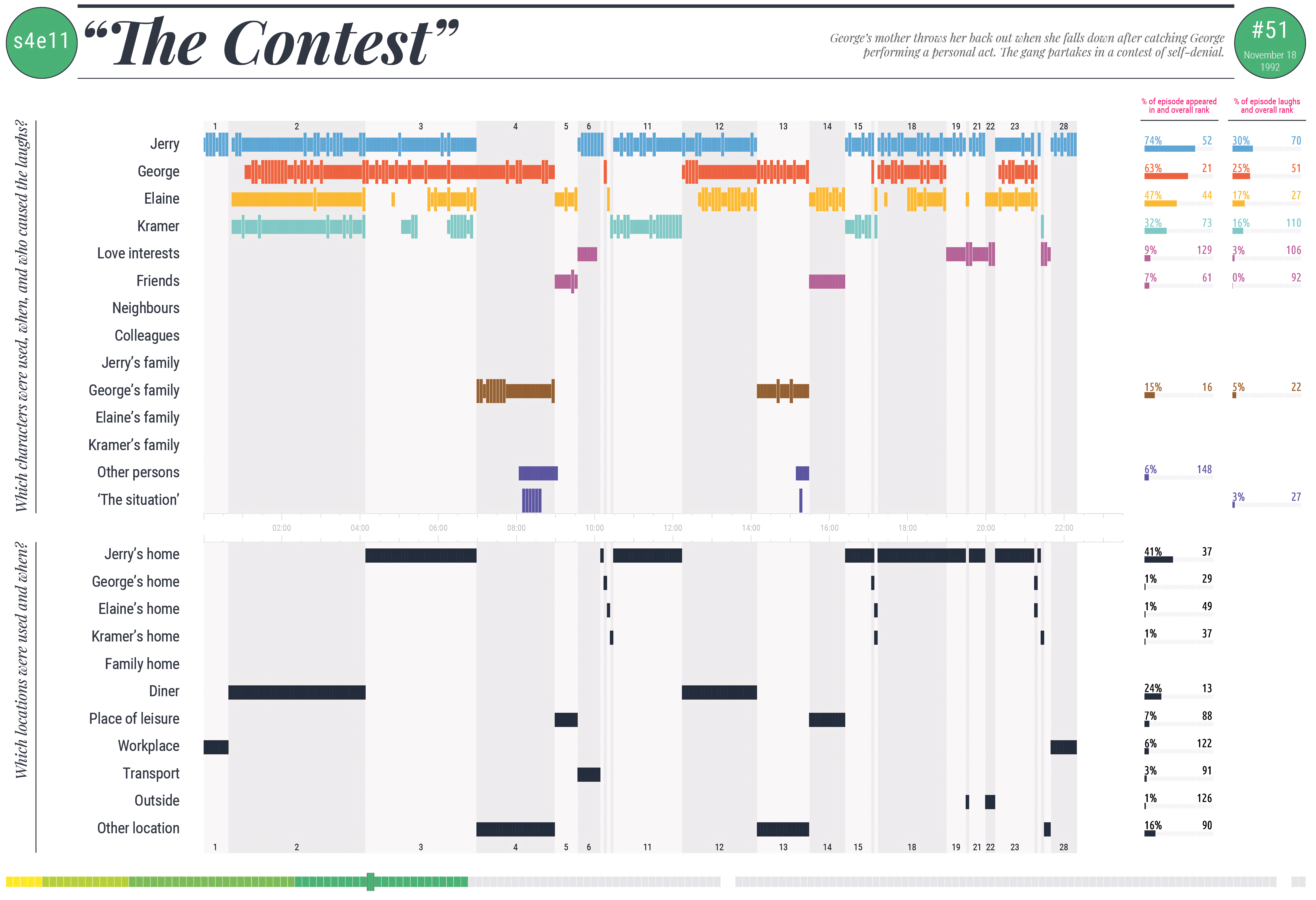
Now that I have you focused on “The Contest”, let me offer you my expertise for this detailed visualization. It marks Season 4, Episode 11 of Seinfeld and shows which characters appear and get laughs at each minute. The top part of the graphic uses colored horizontal bars to represent Jerry, George, Elaine, Kramer, and the other key characters and shows exactly when they come on and how often they get a laugh. In particular, George’s red bar is prominent early on, which likely relates to how his storyline (which involves his mother’s injury and his private dilemma) sets off much of the trouble.
The black bars in the timeline below denote where in the world the scenes take place: Jerry’s apartment, George’s mother’s house (where the mishap goes down), public places like diner and more. Groupings of black bars near the eight-minute mark hint at a long scene set in this family’s home. In other words, George’s mother triggers the whole plot. The location information helps to illustrate how the episode zips between public and private spaces. The characters frequently return home to note the advancement (or lack thereof) in their “contest.”
On the right side, the percentage and rank of each character’s appearance in “The Contest’ 8” are compared to their overall series appearance. Although Jerry is still seen 74% of all episodes, George has the biggest slice of the pie, stressing the weight of his predicament. When you look at the smaller portions doled out to Elaine and Kramer, it’s clear that the spotlight here shifts far more on to George, with the rest relegated to supporting comic roles in the contest.
Top Insights
- George-Centric Plot: His storyline drives the early action, leading to a high volume of laughs linked to his predicament and his mother’s hospitalization.
- Location Dynamics: Much of the comedic tension plays out in family-home settings, underlining how a change in venue from Jerry’s apartment or the diner can spark new comedic energy.
- Supporting Cast Role: Elaine and Kramer still deliver humor, but their bars are less dominant here, reinforcing George’s spotlight in this iconic episode.
- Comparative Presence: Jerry remains a stable comedic anchor, but the data shows how “The Contest”—unlike many other episodes—shifts a disproportionate amount of attention onto George’s awkward situation.
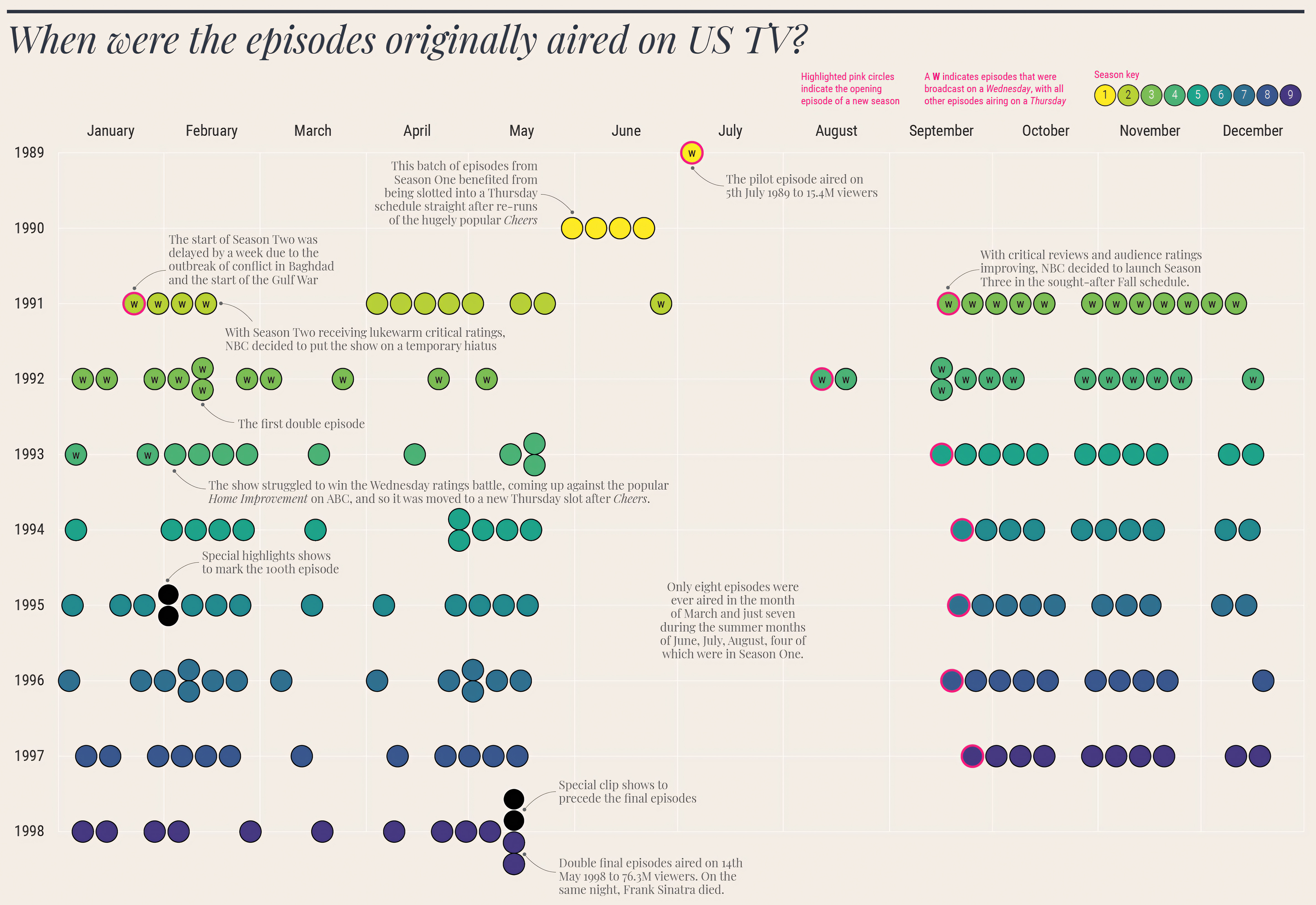
The timeline organizes all Seinfeld episodes by U.S. date first aired, from July 1989 pilot to May 1998 series finale. The colored circles denote seasons, from green, to teal, blue, purple towards the end, while the pink rings denote the first episode of a new season. Each episode features hyperlink to its own page. You will see a “W” on some circles which means that episode aired on a Wednesday. The rest aired on a powerful and popular NBC Thursday.
The annotations on the chart help you understand the show’s scheduling oddities and obstacles. Some of the episodes from the early Season Two got delayed because of Gulf War breaking news. In the middle of the show, Seinfeld was up against some stiff competition on Wednesday nights (for instance, Home Improvement) which prompted NBC to switch it back to the Thursday night slot. You’ll similarly see special clip-show events, mid-season time-slot changes, and short hiatuses, all reflecting how NBC adjusted scheduling to build an audience and take advantage of high-rated lead-ins (like Cheers).
By the end (in the late ‘90s) in 1998 the thing was such enormous hit rates that it had double episodes and clip shows like the Seinfeld two-part finale on May 14 1998 which attracted over 76 million viewers time of night when Frank Sinatra died. The calendar layout shows how Seinfeld went from a low-level, often-bumped show to a real cultural phenomenon, all because of scheduling tricks and things happening in the real world.
Top Insights
- Strategic Scheduling: Early episodes benefited from a prime Thursday slot after Cheers; later, network tinkering moved the show between Wednesday and Thursday to boost ratings.
- External Factors: World events (e.g., the Gulf War) delayed premieres, showing how real-time news could directly impact prime-time lineups.
- Milestone Events: Notable highlights include special clip shows for the 100th episode in 1995 and the much-publicized double-episode finale in May 1998.
- Rising From Under the Radar: The timeline underscores how Seinfeld evolved from sporadic, uncertain scheduling to becoming NBC’s Thursday-night mainstay and a ratings sensation by the mid-’90s.
Why This Infographic Matters
You might ask yourself: why does every recurring character on Seinfeld get an infographic? Because this is a great way to show how all the different gears in the Seinfeld machine turned just right. This data is full of surprises: the characters you never realised were around all the time, the episodes where a parent or a boss hijacked the action, and how Jerry’s main group was present in just about every episode.
If you take a look at this color-coded mosaic, you’ll get to see every character’s screen-time journey at a glance. It’s not just about the moments you likely remember—Kramer’s endless hallway slides, George’s classic Vandalay Industries fiasco, Elaine’s “little kicks” or Newman’s machinations—it’s about the ways the supporting cast melded into the show piece by piece, cameo by cameo. Through this visual representation, you can appreciate how even the most minor characters contributed to the richness of the narrative and the humor that defined the series. Just as in the Simpsons show’s cultural impact, these supporting roles often provided the perfect foil to the main characters, enhancing the overall storytelling. As each episode unfolded, these interactions built a tapestry of comedic moments that resonated with audiences, making every character, no matter how small, integral to the show’s legacy. This interconnectedness of characters mirrors the evolution of Mario games, where every new character or power-up adds depth and variety to the gameplay experience. Just as gamers have enjoyed the interplay between Mario and his friends or foes, viewers delighted in how the ensemble cast of Seinfeld enriched the show’s humor and themes. Each character, regardless of their screen time, played a role in creating memorable moments that, when woven together, showcased the brilliance of the series.
At its core, Seinfeld is a show about characters who orbit around Jerry and his friends’ unusual gravity and always has been. This graphic shows you how much these orbits cross paths. Sometimes for one gag, sometimes one season-long storyline. In other words, if you think you know Seinfeld, you don’t know Seinfeld. There’s more beneath these colorful squares. If you’re anything like me, you may want to rewatch every single episode (maybe with the chart in hand) to see how often there’s an actual punchline that corresponds with one of the colourful squares. If a data-based viewing of the best sitcom ever made doesn’t excite you, I’m not sure what will. This visual breakdown of Seinfeld episodes not only highlights the intricate web of connections between characters but also reveals the brilliance of the show’s writing. Each colorful square represents a moment that may seem trivial at first, yet upon closer inspection, becomes a crucial part of the narrative fabric that makes the series so iconic. By diving deeper into these interactions, fans can appreciate the cleverness and creativity that define Seinfeld, transforming a casual viewing into a delightful exploration of comedic genius.
But hey, that’s Seinfeld. That’s data. And if you’re anything like me, you’ll find yourself itching to rewatch every episode (maybe even with the chart in hand) to see if the comedic chemistry aligns exactly as all those squares promised. Because if a data-driven viewing of the world’s greatest sitcom doesn’t fill you with joy, I don’t know what will.
So do yourself a favor, folks—get yourself a cup of joe, have this infographic handy, and see if it doesn’t make you appreciate the show about nothing at least a little more. Because “nothing”, as it turns out, is actually a whole lot of something as far as data is concerned.