DOWNLOAD INFOGRAPHIC IN HIGH RESOLUTION
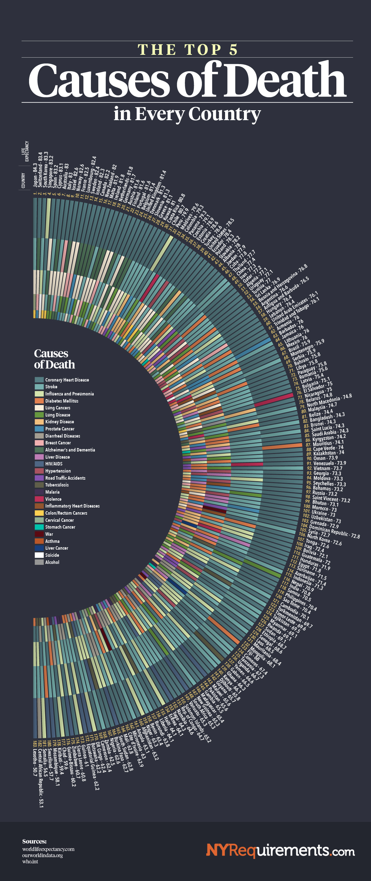
This stunning infographic visualizes the top five causes of death across every country, providing a unique perspective on global health trends. Presented in a striking radial format, the data tells a story of how mortality varies across nations and regions, revealing insights into healthcare quality, socio-economic factors, and lifestyle differences.
The Structure: Life Expectancy as the Backbone
The infographic is organized in a circular format, ranking countries by life expectancy from highest to lowest, starting at the top. Countries like Japan, Switzerland, and Spain—renowned for their long lifespans—dominate the upper section, while nations with shorter life expectancies, such as Chad and the Central African Republic, appear at the bottom.
Each country is represented by a stack of five color-coded bars, corresponding to its top five causes of death. The length and order of these bars make it easy to compare the data across countries.
What the Data Reveals: Wealthier Nations vs. Developing Nations
- High-Income Countries (HICs)
Nations with the highest life expectancies tend to have chronic, non-communicable diseases (NCDs) as their top causes of death. These include:- Coronary Heart Disease (CHD) and Stroke are nearly universal, reflecting aging populations and lifestyle factors like diet and physical inactivity.
- Alzheimer’s and Dementia emerge prominently in aging societies, where extended lifespans increase susceptibility to neurodegenerative conditions.
- Cancers—such as lung, breast, and prostate—are also common, as better healthcare systems enable longer survival, exposing individuals to diseases associated with age.
- Middle-Income Countries
These countries reflect a mix of infectious diseases and lifestyle-related conditions. For example:- Diabetes Mellitus and Hypertension appear alongside infectious diseases like Influenza or HIV/AIDS.
- Traffic accidents, violence, and occupational hazards also become prominent, reflecting socio-economic transitions.
- Low-Income Countries (LICs)
Lower-income countries face entirely different challenges:- Infectious Diseases dominate, including Malaria, Diarrheal Diseases, and Tuberculosis, pointing to poor sanitation and limited access to healthcare.
- Violence and external factors (e.g., war and famine) also appear, underlining the impact of unstable socio-political conditions.
Key Trends and Patterns
- Heart Disease as a Global Killer
Coronary heart disease is the leading cause of death across a majority of nations, reflecting its ubiquity in both high- and middle-income countries. - Stroke: A Silent Epidemic
Stroke consistently ranks high globally, particularly in middle-income countries where diet and hypertension management are evolving health issues. - Infectious Diseases Persist in LICs
In nations with shorter lifespans, diseases like malaria, tuberculosis, and diarrheal illnesses remain common, underscoring the need for investment in sanitation, vaccines, and basic healthcare infrastructure. - Cancer in Developed Nations
Lung cancer leads in many developed countries, often tied to smoking prevalence. Breast and prostate cancers reflect longer lifespans and improved diagnostic capabilities. - Alzheimer’s and Aging Populations
Neurodegenerative conditions are almost exclusive to high-income countries, emphasizing the challenges of an aging population and extended lifespans.
Visualizing Regional Disparities
- Africa: Predominantly affected by infectious diseases, highlighting the region’s struggles with healthcare access.
- Asia: A diverse range of causes, with higher-income areas resembling the West while lower-income regions face infectious diseases.
- Europe and North America: Chronic conditions dominate, reflecting lifestyle trends and aging demographics.
Policy Implications
This infographic goes beyond being a simple data visualization—it’s a call to action.
- For High-Income Nations: Focus on preventative healthcare to manage chronic diseases and improve quality of life in aging populations.
- For Developing Nations: Address the dual burden of infectious and chronic diseases, alongside improving access to vaccines, clean water, and nutrition.
- For Low-Income Nations: Invest in basic healthcare systems, combat preventable diseases, and tackle socio-economic disparities.
Conclusion: A World of Contrasts
This infographic is a testament to the interconnectedness of health and socio-economic development. By visualizing the top causes of death, it paints a picture of both global disparities and shared challenges. Whether it’s combating infectious diseases in LICs or managing the health risks of aging in HICs, the data here tells a powerful story of where humanity stands—and where it needs to go—to improve global health outcomes.


